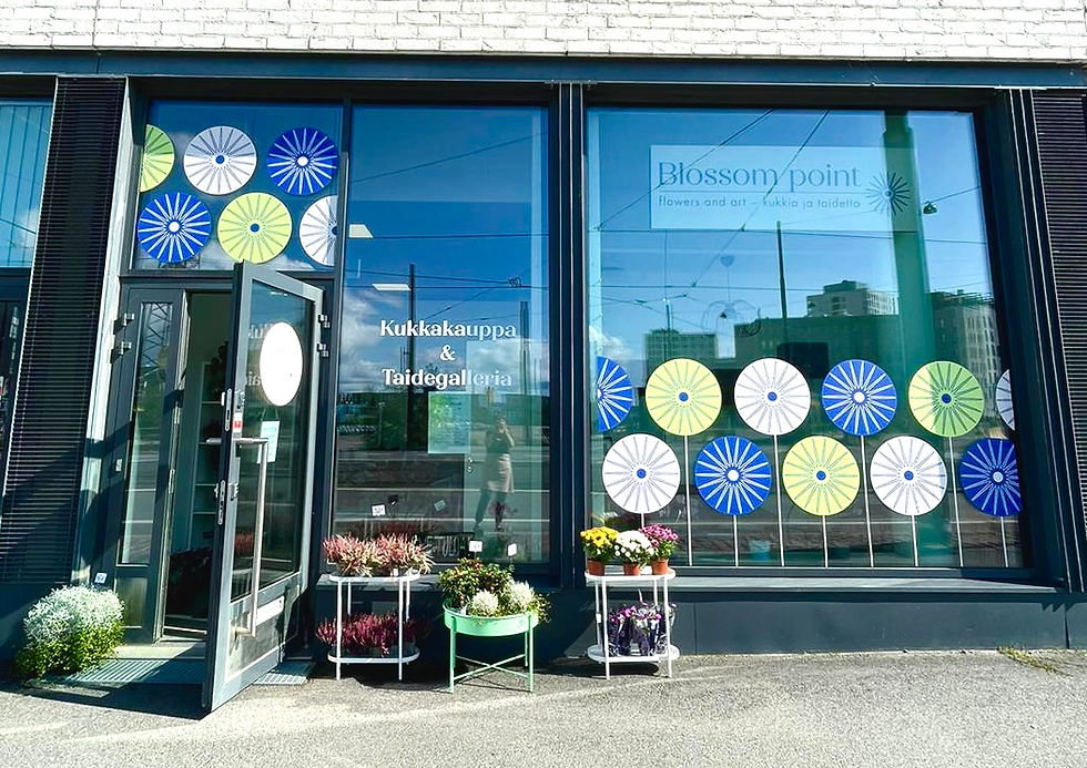
A place in Jätkäsaari where creativity blooms
Blossom point brings creativity, beauty, and artistry to a modern district of Helsinki. Both locals and visitors can celebrate creative freedom and enjoy fresh, delightful floral designs made with imagination, an open heart, and vibrant love.

BLOSSOM POINT – Brand Identity
Brand Book
Packaging Design
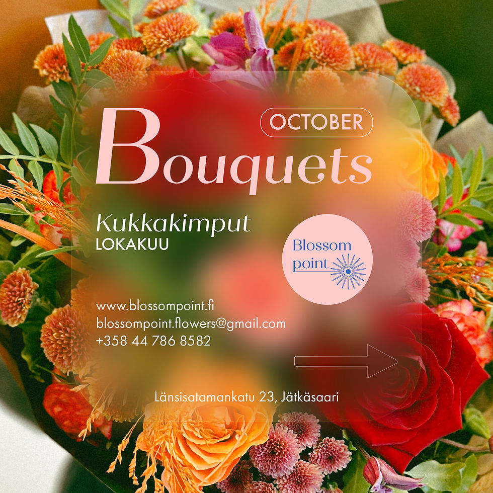
Campaign Design
Photography & Video Production
Social Media Design
Web Design
Newsletter Production

Featured Work
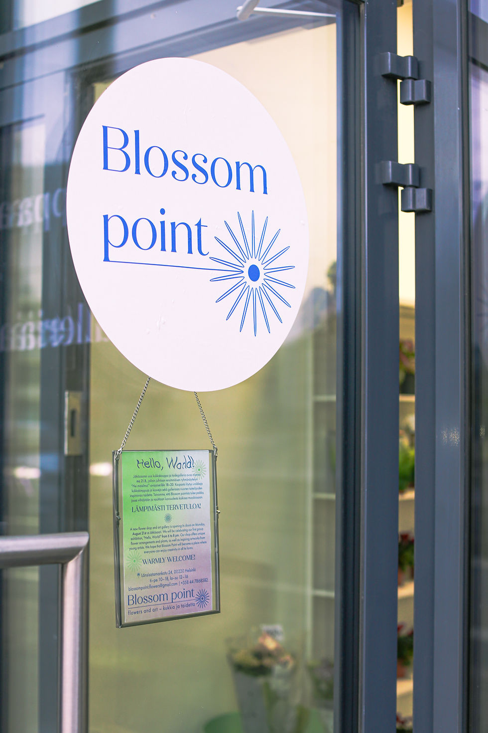
The combination of floral studio and art gallery was a two-way process, with each influencing the other. The name “Blossom point” signifies a destination where creativity and nature converge, highlighting the synergy between artistic expression and botanical aesthetics.
The logo is minimalistic and clean, making it both memorable and perfectly aligned with the brand’s essence. At its core is the key visual element: a stylized flower with a point at the center.


The color palette of the Blossom point brand reflects its core values and the unique environment that shapes it. The primary colors are light pink and blue.
Light pink conveys floral softness, elegance, and a poetic touch. Blue symbolizes the Baltic Sea that is located just a few hundred meters from Blossom point, and serves as a modern alternative to the traditional black often seen in art galleries.
The secondary colors enhance the brand’s personality:
Bright green – nature, growth, and joy;
Orange – warmth, creativity, and friendliness;
White – openness, clarity, and structure.
Together, these colors create a harmonious visual identity that not only complements the brand aesthetically but also communicates its story and values with authenticity.


A Confident and Cohesive Identity
The interplay creates a brand identity that balances creativity with functionality celebrating meaningful details, emotional connection, and the harmony of two worlds coming together.